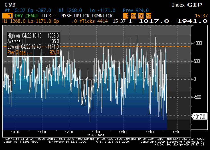
Taken from a Zero Hedge post titled "NYSE 2,300 Up/Downtick Margin". The only commentary they provide is this: "Just another day at the NYSE where people are either all buying, or all selling. NYSE is going from +1,300 (upticks) to -1,000 (downticks) in a matter of seconds.
a1 or rad or anybody else....can you help me out in understanding this chart? Upticks occur when the last price is higher than the most recent different price and downticks occurs when the last price is lower than the most recent different price, right?
I'm just trying to think about the ultimate implications of this information. It means that the NYSE stocks are shifting from vastly on upticks to vastly on downticks constantly? Does that mean the market is acting irrationally somehow on a large scale? Or is this to be expected? Why/why not? Obviously y'all will probably have an idea how this correlates to the historical ballpark averages. I love trying to learn how to think about all this stuff...interesting as hell to me.
Anyway...any thoughts at all?
I've never met a retarded person who wasn't smiling.
just showing the volatility of the market...to me, i look at it and it tells me that the market lacks true conviction...meaning that there's really no long term view of the market...mind you, the definition of long term view these days could be as short as a 3-6 month view...perhaps as short as a 1 month view if you can believe that...traditionally - long term meant years...as much as 10....even longer.
the reason why the long term view definition has changed the last 18 months has everything to do with the general malaise of the financial system and economy...investors are just not sure and the 'real money' continues to be on the sideline waiting for more stable, more conventional markets to place their big bets...so while the 'real money' guys are biding their time (and hoarding up cash creating the liquidity crunch we keep hearing about), fast money guys and the like are the only ones participating.
that point relates to the last thread you started about liquidity and that the market REALLY doesn't know what 'drying up' actually is until the program traders disappear...whether you believe that or not is not the point...point being and what the chart probably suggests is that with these fast money guys or program traders or quant traders or day traders at the 'steering wheel' of the market these days, massive volatility will be the order of the day for many days, weeks, months, quarters to come...real money guys analyze and trade on fundamentals of the company's stock they are trading...fast money guys are trading on technicals...and from a technical standpoint, there's lots of data available that can be analyzed that can change a fast money guys feeling on a position they might take (or not take)...sell banks because they're taking TARP funds, buy them because they're reporting better than expected earnings, sell them because gov't is running them, buy them because banks are healthy enough to give TARP funds back, sell them because geithner says we're not out of the woods yet, buy them because PIMCOs bill gross says he's buying select banks, sell them because gov't wants BofAs CEO to resign, buy them because banks are laying off again and cutting costs, sell them because banks are laying off again and cutting costs.
at the end, the 'main' participants of the market want to sell and are waiting for reasons to sell while they are as well willing to buy but are waiting for reasons to buy...the health of the market won't be judged by the activity of the fast money guys...it will ultimately be judged when the 'real money' steps back in...til then, we'll continue to see big swings intraday and day-to-day...this chart was a good chart for a buyer at 1245PM and a seller at 315PM...it sucked for a guy who sold em at 945AM and covered at 230PM
I'm just glad to know there are actually "big money" guys out there...how much longer will they continue to have their big money with the market being as it is? I guess these are really BIG money guys...amounts of which are so big it's hard for me to comprehend, huh?
Right now the fast money guys seem to be the only ones participating in the market....these days it's all about computing power and executing your trade a few milliseconds before the other guy's computer has time to process and execute...scary shit...if this keeps up I may never put money into the stock market in my lifetime. I refuse to be the greater fool and that's the only game being played on the Street these days.
I've never met a retarded person who wasn't smiling.